
Title: TOME Discussion
Source: Blog – DH Lab
URL: http://dhlab.lmc.gatech.edu/uncategorized/513/
Following the previous two blog posts where I looked at a few topic modeling interfaces, I’ll return to the lab here and write about TOME. These are based on image documentation of the project – not actual interaction with the program.
Strengths:
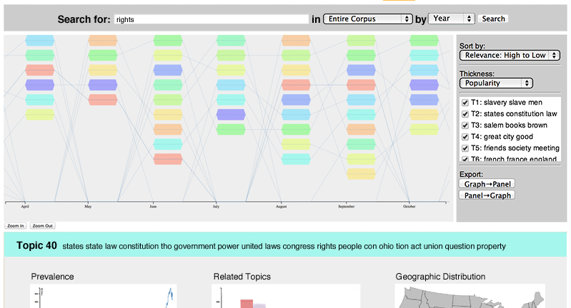
Multiple views: One of the first things I noticed was that it combines different views onto one page. This combines the previous two interfaces I discussed – where one had too many disparate views and the other had one view, but was limited in other representations as a result. Here, the main visualization can be seen at the top and is clearly the most important since it is the largest. Underneath, which is cut off in the image, are other visualizations including prevalence, related topics, and geographic distribution. This might require scrolling, but is certainly better than a completely different page.
Sorting and filtering: There appear to be many different ways to sort and visualize the display – including by year, relevance, popularity, and within a certain group of documents. For exploratory purposes having more options is a good thing – so long as it doesn’t get overwhelming.
Limitations:
Scrolling: It always depends on how many topics there are, but it would be ideal if they could all be shown without requiring scrolling.
Searching: Less of a limitation, but more of a note on how users will vary on their needs based on how much they already know about the topic and/or sets of documents. The standard search bar is good if you already know what you’re looking for, but otherwise it is not very helpful and might cause frustration.